RESORT
Visual Identity for a Japanese brand consulting and realisation company in Tokyo
Design & Art Direction: Miki Kadokura
CL: Resort (Tokyo)
Swim is a brand consulting company in Tokyo with several departments. The new department Resort is helping clients to translate the charm of unfamiliar things. The clients of Resort is mainly exploring certain things in narrow areas outside of Japan and therefor Resort wanted a visual identity that connects Japan with the world.
The owner of Resort had the idea that the flat peach origin from Island of Malta was an inspiring thing that could be used in the visual identity. The flat peach origin from Island of Malta became a key item in the visual identity as it differs from other peaches and can be described in taste, smell and form. The work of Resort could relate to describing the difference between the flat peach in compare to other peaches. The peach also have the same meaning in both Asia and Europe which makes it a good example of a connection between the two continents. The company also found inspiration from the old silk road connecting Japan with Greece, Eldorado as in paradise, Jomon (pre-historic Japan). The typography is from early Europe with carved letters in stone and from China with calligraphy.
By using the inspiration from pre-historical events through the visual identity, the goal is to show the companies cultural knowledge.
RESORT
Visual Identity for a Japanese brand consulting and realisation company in Tokyo
Design & Art Direction: Miki Kadokura
CL: Resort (Tokyo)
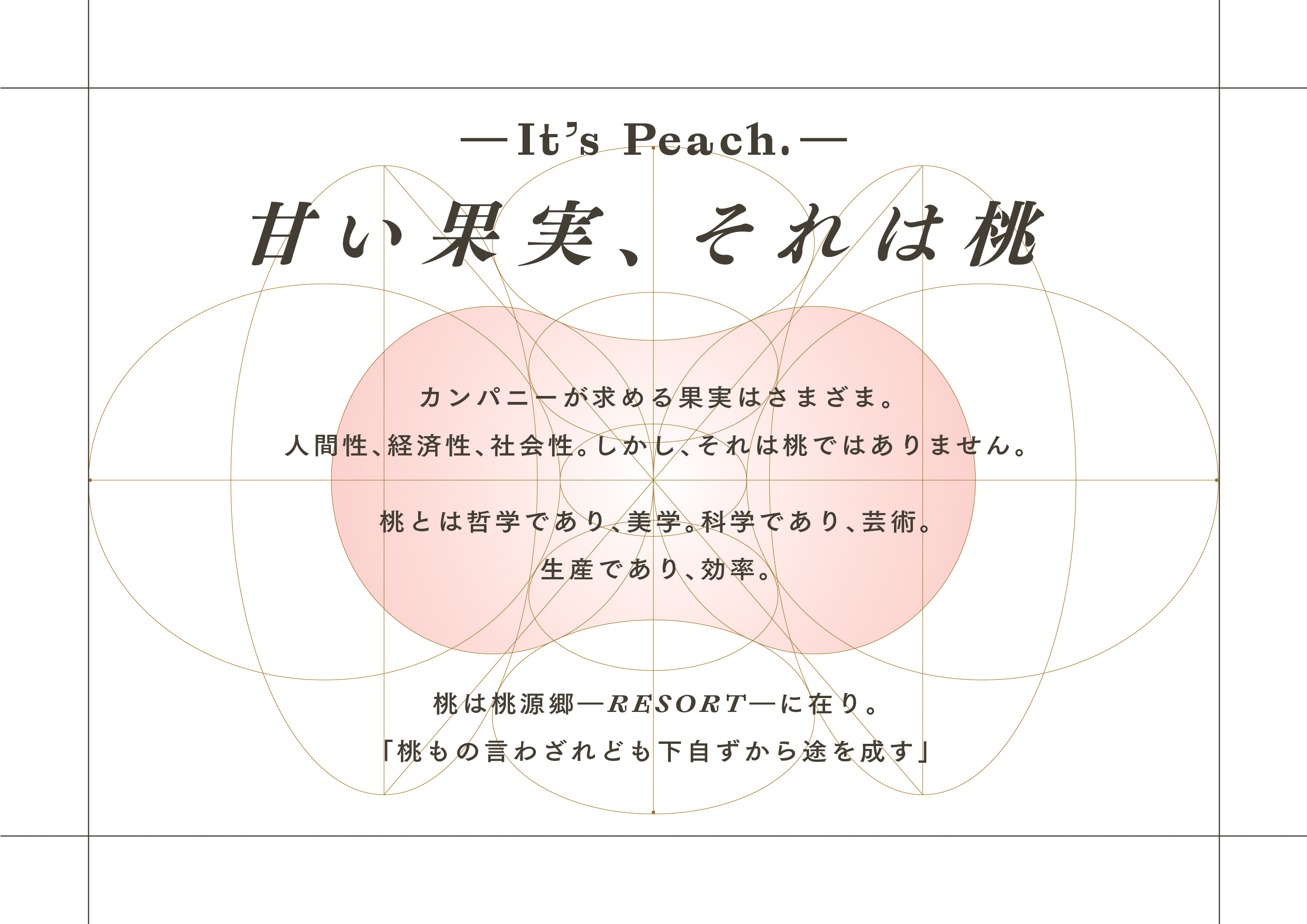
カンパニーが求める果実はさまざま。
人間性、経済性、社会性。しかし、それは桃ではありません。
桃とは哲学であり、美学。科学であり、芸術。
生産であり、効率。
桃は桃源郷ーRESORTーに在り。
「桃もの言わざれども下自ずから途を成す」
甘い果実、それは桃
It’s Peach.
筆舌に尽くしがたい幻の果実、桃源郷の桃。その味と香り、形などを、いかに他人に伝えることができるか。ブランディングを「桃の魅力」に例えた、斬新なブランディング戦略を携えるコンサルティング企業のCIをデザイン。
RESORTから連想される、ギリシアの甘美かつ完璧な肉体、シルクロードを通じて日本へと伝えられた、桃の様々なシンボルやメタファー、遠く南国からもたらされるパッションフルーツの商標など、桃とリゾートにまつわる、様々な日本へのベクトルを曼荼羅のような、1つのエンブレムとしてまとめあげました。
